Thursday, May 31, 2007

Creature Art!

Here's some random stuff out of one of my sketchbooks. Creature art and dog boy.
These were done during our flight back from California.


I had reference for the dog.


Here are some truly killer links!
Humberto Ramos
Scottie Young
Jose Luis Munuera
Mike Kunkel
Sylvain Guinebaud
Cloudy Pool
Pierre Alary
Kahnehteh

Bobby

Tuesday, May 29, 2007

ela samba

This one was inspired by one of my great passions: Samba dancing.


Mas que nada
Sai da minha frente
Eu quero passar
Pois o samba esta animado
O que eu quero e sambar
Este samba
Que e misto de maracatu
E samba de preto velho
Samba de preto tu


gouache on cardboard, 8 1/2 x 5"

One, Two, Tree

Two sketches today--both for the all new Practice Makes Perfect Art Jam, a new blog started by Ric Nicholls, which I am now a contributor to. Ric is one of the moderators of the He-Man.org fan-art forum that I mention so frequently, and he also happens to be an uber-talented artist. Check out his blog--it's linked on the sidebar!

Anyways, the first challenge was to come up with a "Living Tree of Woe," with an emphasis on working out the facial expression. After doing a couple of pages of fast pen sketches, I picked out the one that I liked the most, did a tight pencil version of it, then scanned and colored it:

click above for larger view

To be honest, I think I got carried away with trying to get the tree part right, and failed to really nail the facial expression. I'm lame!

Anyways, while sketching, I also drew a tree of woe with no face at all, emphasizing body language instead. I quickly tightened some pencils over it, scanned it, and slapped some colors on:

click above for larger view

I realize this in no way makes up for my failure to get the face right on the first one, but I just figured I'd share it since it was a by-product of my first attempt.

Comments and critiques?

Check out the Practice Makes Perfect Blog for everyone else's entries!

Friday, May 25, 2007

Burn baby, burn!

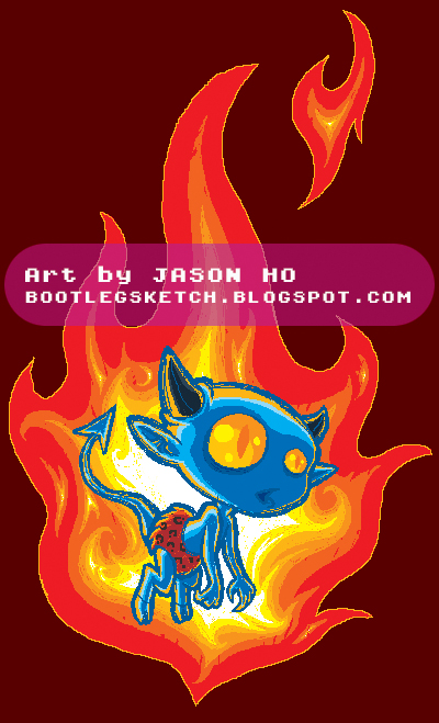
Another pixelly pencil-tool Photoshop sketch:


The way this was originally drawn, the devil boy was supposed to be engulfed in flame. Obviously the way I colored it changed it so that the flame is really just behind him. I'm not sure if my attempts at depicting fiery backlighting were successful at all, but I did have fun with this one. The cold versus hot color scheme is, I think, something that I subconsciously was trying to swipe from the Brothers Hildebrandt.

Tuesday, May 22, 2007

Subway Sketching is back on! ..and Motorcity con Review

And we're back from our little adventure in the Motorcity con! Though the attendance was not amazing, it was nice to meet new faces and for once, we really got to walk around and visit all the artists that came. Among the great artists that we had the pleasure to see again and meet for the first time were Sergio Aragones, Stan Sakai and Guy Davis..just amazing people. If you haven't heard of them, you should. All in all, it was a cute and modest con--and its only gonna get bigger!

So Subway sketching will resume this week as normal..hope to see you there!

Here's something I did from the line..

-Kei

Online Digital Painting Classes on Schoolism


My online digital painting classes at Schoolism is going into it's 3rd week. The students are learning about textures this week.

For anyone interested in signing up, next class starts June 26th. It's more than half full.

Here's the assignment that the students were given to paint for the first week. This one is a muscle man I painted for the demo. I picked to paint this muscle bound guy for the first class because then we only have to deal with one basic element - flesh. No hair, clothes (except for his speedo of course), color or background. This helps the students concentrate more on the brushes and techniques for the first class and not getting overwhelmed with too many other elements.

The best way to learn is by isolating one particular way of thinking at a time so that you can put your sole attention on it.

Bobby

What is thy bidding, my master?

The title of today's post is a quote from Star Wars (Empire Strikes Back, actually), though I'm just using it here because it seemed appropriate for the body language of today's sketch:
click above for larger view

Also posted on the He-Man.org fan-art forums. My post is here, the entire thread (including some of my previous sketches) is here.

This is Scare Glow, another of Skeletor's thugs, who was introduced towards the end of the toyline, arguably after the franchise had "jumped the shark." He was originally billed as the "Evil Ghost of Skeletor," though this was never further clarified or confirmed in any official manner. It seems like fans generally agree that he is probably not Skeletor's ghost, and that works fine for me. As a result, I have changed his title to "Evil Ghost Warrior."

The drawing itself is actually several months old--after I completed Skeletor, I had a couple of failed attempts at Scare Glow that got as far as inks, but didn't quite sit right with me... actually, those first few attempts just plain sucked. What you're looking at is my third attempt, and I'm pretty happy with how it turned out. The pose is meant to convey Scare Glow's standing as I see it--one of the deadliest and most trusted of Skeletor's minions. Anyways, this pic had been sitting in my hard-drive half-colored for months, and now here it is.

Before I sign off for the day, an anal retentive point that I want to address--Scare Glow's weapon is frequently referred to as a scythe, and I'm sorry but that is hands-down, one-hundred percent wrong. A weapon does not automatically become scythe just because it's wielded by a grim reaper-like character! I should however, clarify that I'm talking about the classic Scare Glow--the Scare Glow for the 200x revamp, actually did carry a scythe. But back to the classic version--I've also seen it referred to as a halberd, which is much closer, but still not quite right, because Scare Glow's weapon lacks a spike at the head and a hook or thorn on the backside of the blade. I thought that it was a glaive, but this too was a mistake, as closer inspection revealed that a glaive's blade is mounted on the end of the pole, not the side. Further investigation lead me to the lochaber axe, which is pretty close--but again, Scare Glow's weapon lacked a vital component--a hook at the head of the pole. Finally, my research turned up the bardiche and the voulge--both seem like they could work, but I'm guessing voulge is the way to go.

Do we have any medieval weapons experts who can give us a verdict? Or maybe just a really well versed fantasy RPG fan?

Post Script: Sorry Buffy-fans, THIS isn't a scythe either--alliteration does not make a scythe a scythe!

Monday, May 21, 2007

I caught up on comments this weekend!

Just a quick heads up for anyone interested--I caught up with responding to comments going all the way back to the beginning of April. Sorry for being so delinquent--I'll try to do better job keeping up in the future. A special thanks to everyone who took the time to leave a comment. The feedback is appreciated!

**EDIT** For whatever stupid reason, I had comments on the post below turned off. I am an idiot. Comment away, if you so desire. Thanks, and sorry for the inconvenience!

Friday, May 18, 2007

I don't actually have a magenta hoodie or red hair... or neon skin... or a turquoise shirt...

Taking a break from vector art and He-Man--a self portrait to appease my tremendous ego:
click above for larger view

This started out as kind of a quick random sketch done for the sake of fulfilling my Friday post (hence the self-deprecating word balloon and the super hi-larious t-shirt text). I felt somewhat lukewarm about it, until I stumbled upon the idea of using an abstract color scheme. Now I'm actually pretty happy with it.

The style of this piece resembles an Oekaki, but rather than using a dedicated Oekaki program or interface, I just used the pencil tool in Photoshop to sketch and color this. The simplicity of sketching with the pencil tool is something I've been enjoying, and I dig the pixelly pseudo-16-bit look.

Post Script: Perhaps you've noticed the advertisement on the sidebar for Skill City? Check it out--it's free and fun, and... what do you know, my dear friend and longtime crony Jacob designed 90% of the visuals. Seriously, it's good stuff, and I will gladly play anyone a game of Librum Confundo! My screen name on Skill City is "Ohsnap"--drop by and say hi!

**EDIT** It was brought to my attention that I should have warned people that Skill City is for Windows only. Sorry!

**EDIT#2** For whatever stupid reason, I had comments on this post turned off. I am an idiot. Comment away, if you so desire. Thanks, and sorry for the inconvenience!

Tuesday, May 15, 2007

Detroit Motor City Comicon May 18-20! Subway sketching is cancelled this Sunday.

Hi all

This Sunday subway sketching will be cancelled because we'll be at the Motor City Comicon! If you're in the area, feel free to come on by. I'm told its going to be a great show!

Here's a subway sketch from last Sunday. After, I sketched on it in Photoshop

Where's the Beef?

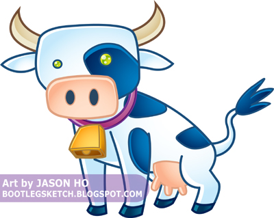
More vector fun...


I'll be brief today: I'm starting to get a better handle on this vector stuff, i think. I'm satisfied with most of my color choices and gradient placement on this one, but I need to work on my vector drawing skillz--I should probably start playing around with different brushes rather than sticking to strictly uniform lines. As for subject matter, this cow has no particular significance--just a little doodle that I decided to vectorize.

Friday, May 11, 2007

Fishy!!!

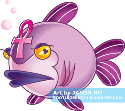
A while back, I was IMing with Charles, and he suggested that I draw a mystical fish. I recalled this whilst trying to think of a simple subject for a vector sketch, and so:


Sketched loosely in Photoshop, and inked and colored in Illustrator. After my previous attempt at vector illustration, I decided to make things simpler and more stylized. Though I think in this case, I went a little too simple. Ah well, damned if you do, damned if you don't. I shaded this guy using some techniques that I have observed in the better executed vector illustrations of others. As far as the colors go, I'm basically satisfied, though I wasn't quite sure what to do with the gills (and I think it shows) and the eyeballs lack the illusion of depth that I was going for.

More vector stuff to come. By the way, in case you didn't know, that thing on his head is an ankh.

Post Script: Charles said he was going to write a profile for this little guy, but he's been having some computer troubles, so there's gonna be a little delay on that. I will post an update when he can get around to it!

**EDIT**
Well thankfully, Charles got his computer in order, and he posted the mystical fish's extensive background story, entitled "The Children of the Gods"!
Go read it! Go!

Tuesday, May 8, 2007

Patrick Morgan's Whale Boy

Here's another piece I'm doing for a friend. This one is for our buddy Patrick Morgan. He asked Kei and I to do our version of his character designs "Whale Boy."

Here's what the original WHALEBOY character design looks like:

And here's my twisted version. I'm having a great time with this painting. I'll post some wips (Work-In-Progress) pics.


Here's the final!

Monday, May 7, 2007

To the Vector Go The Spoils

Another exhausted early post:

A little something different--today's illustration was sketched loosely in Photoshop and then inked and colored in Illustrator (I did also do a few tiny touch-ups in Photoshop). For those who don't know the difference, Illustrator is a Vector-based graphics program, while Photoshop is a Pixel-based graphics program. This page gives a quick overview about the differences between the two, and you can read here if you want more details.

click above for larger view

The colors are not quite what I expected--they looked different after I imported the image into Photoshop. I think maybe I need to adjust my color profile in Illustrator or something? Maybe someone who, unlike me, actually knows what they're talking about could offer some helpful advice about this issue?

The whole purpose of this was to practice my vector skillz, and on that note I think this drawing/concept was just a little too involved for a vector rookie like myself. To achieve what I'm envisioning in my head (in terms of vector illustration), I need to learn to simplify shapes a bit more, and general simplify and stylize my drawings. I am however, happy with the way the bamboo "print" on the tunic turned out. It's far from perfect, but as an experiment to gauge what I can do with vector illustration, it was a success.

Since the completion of this piece, I've done a few simpler vector sketches, which I will, of course, be sharing over the next few weeks, dear reader.

Sunday, May 6, 2007

Videocast. New collaboration piece with Alberto Ruiz

Here's a new painting I did for Alberto Ruiz's Eye Candy book. He drew it (from his Pistolas book) and I painted it. I wanted to keep it creative and incorporate his lines in the painting as well.

It's always fun to experiment from time to time.

Bobby


The video cast is the initial sketch I did for this painting.
Part 1


Part 2

Friday, May 4, 2007

Calgary Expo Review

Hi Everyone,

We just got back from the Calgary Expo on Wednesday.

It's was one of the best comicons we've been to. Great crowd, friendly people. Fantastic organizers. The BEST hospitality out of all the cons. Thanks to Kandrix and Laurie and all the rest for the awesome time they showed us! We couldn't be prouder that this is a Canadian event.

First night, we shared a ride to the hotel with Ryan Woodward (storyboarder for Spiderman 3 and fellow teacher) then went out partying with our buds Stephen Silver, David Colman, Patrick Morgan, Jose Lopez and our new friends Louie Del Carmen and Octavio Rodriguez. Amazing group of guys.

Second day was the convention. Great friendly crowd. Extremely well organized! Just awesome. Got to see some good friends as well. Freedom fighter: Alberto Ruiz and his ever growing army of independent artists Robin Mitchell, Joe Pekar, Andrew Wilson, Wade Schin. Cheeks, wish you were there buddy. You missed out! Ah.. there's always next year though. Also always good to see our SF buddy John Giang.

The view from the plane


Here's some pics from our booth


After the convention the guest artists were invited to go to Banff for some R&R. We met Bruce Timm and hung out with Francisco Herrera, Humberto Ramos, David Colman, Andrew Wilson, John G and the Udon crew (our Wii coach Jim Zubkavich and the GTA posse Francis Manapul, Agnes, Marcus To, Omar Dogan and Joe Ng).

Playing Texas Holdem with Chicklets.


For all those that didn't make it out, be SURE to go there next year. Check out the view in Banff.


Here's one of our postcards stuck in the snow on the top of a mountain. Don't worry, we didn't leave it there :)


Thanks again Kandrix, Laurie and all the fine people in Calgary for being so friendly and hospitable.

Bobby

Some beautiful links
Octavio Rodriguez
Louie del Carmen
Enrique Fernandez
Daniel López Muñoz

DUCK WEEK PART 2: Horduck!

Typical tired Thursday night = early post:

I was watching my She-Ra DVDs, when something about the villain Hordak caught my eye--what's up with his crazy duck feet? Check out this post on Busta Toon's blog to see what I'm talking about. Anyways, a hilarious image popped in my head and I came up with this:

click above for larger view

I actually drew this several months ago, just after Christmas, I believe, and had left the colors in mid-progress. But when Super-Munkyboy started an art jam challenging entrants to turn a superhero or villain into animal, vegetable, or mineral, I thought this would be appropriate. I will update with a link when Super-Munkyboy posts the other entries.

The colors on this sucker follow Hordak's animation model pretty closely. Same with the costume details, with the exception of the obvious, you know... duckification. I'm happy with how the smoke turned out--I've been playing around a little with incorporating gradients recently, rather than sticking strictly to two-tone cell-shading.

So originally this was intended to just be an anthropomorphic version of Hordak, but then I got to thinking--given the level of silliness in the old He-Man and She-Ra cartoons, Horduck could easily be incorporated into that universe! And so:

* * *

PROFILE: As a result of his technological and magical enhancements, HORDUCK is capable of shapeshifting in the same manner as Hordak, though his range is more limited. He has enhanced strength and stamina, and possesses thermal vision. Horduck is a classic bully with a Napoleon complex. He sincerely idolizes Hordak, and Hordak, as a result of a huge ego, humors this behavior. However, Horduck and Imp loathe eachother, as Imp percieves (correctly) that Horduck seeks to usurp his position as Hordack's trusted messenger and protege.

HISTORY: A sickly slave from Hordak's homeworld, the tiny despot who would become known as Horduck was the subject of experimentation by Modulok. Emerging from the experiments with enhanced powers and strength, he was raised by Shadow Weaver and Hordak, and indoctrinated in the ways of the Horde. Although he constantly claims to be a "Ducktator" of the outer territories of Etheria, in reality he's merely the officer in command of a small Horde expeditionary force. Currently, he and his squadron are terrorizing a colony of Sagarian Trobbits. The Trobbits however, have allied themselves with the local Twigget population, and a group of Eternian Widgets who've found themselves stranded on Etheria.


* * *

Also posted on the He-Man.org fan-art forums. The thread is here.

And so, DUCK WEEK(TM) draws to an epic conclusion! In case you missed it, I did post a Duck-related review on Wednesday--scroll down to check it out. Stay tuned for more Bootleg Sketch Mega-Events(TM) in the near future!

Wednesday, May 2, 2007

DUCK WEEK REVIEW: A Duck-Related Comic Gem!

Dungeon By Joann Sfar, Lewis Trondheim, and Various; English editions published by NBM.

  • Dungeon Volume 1: Duckheart (96 pages, full color, $14.95)
  • Dungeon Volume 2: The Barbarian Princess (96 pages, full color, $14.95)
  • Dungeon The Early Years Volume 1: The Night Shirt (96 pages, full color, $14.95)
  • Dungeon Twilight Volume 1: Dragon Cemetary: Duckheart (96 pages, full color, $14.95)
  • Dungeon Twilight Volume 2: Armageddon (96 pages, full color, $14.95)


Please note that these are only the volumes available in English, and as of this writing, there is one more English volume that I have yet to obtain/read--expect another review in the future!
A series of graphic novels, originally published as Donjon in France, Dungeon tells the story of Herbert the Duck, his friend Marvin the Dragon, and their boss, the Dungeon Master Hyacinth (who, if I'm not mistaken, is a chicken). The main series focuses on Herbert's adventures, the Early Years sheds light on Hyacinth's life before he became Dungeon Master, and Twilight tells the of the last days of Marvin and the end of the world.

A fantasy adventure peppered with RPG references and filled with slapstick comedy, Tom & Jerry-esque violence, dark humor, and absurdism, Dungeon nevertheless depicts a complex world populated by sympathetic characters with great depth. The dramatic moments are poignant and never over-done.

Verdict: Awesome. It's really tough for me to convey just how much I enjoy this series. Economically, the comic book industry has been very healthy for the past few years, but in terms of content, there hasn't been much that has appealed to me. Dungeon is a very compelling breath of fresh air--the closest comparison I could draw is the widely lauded Usagi Yojimbo, another comic book tale of an anthropomorphic warrior in an ancient time. At any rate, Dungeon is highly recommended--give the first volume (Duckheart) a try! Just one word of warning--these books aren't necessarily for kids! Give it a read before you hand it to a wee one.

For More Duck Adventures In Sequential Art: The Life and Times of Scrooge McDuck, by Don Rosa (256 pages, full color, $16.99)--the title pretty much explains it all!

Tuesday, May 1, 2007

DUCK WEEK PART 1: Blathering Blatherskite!

Welcome to the very first Bootleg Sketch Mega-Event(TM): that's right, it's Duck Week(TM)! What does that mean? It means that I'll be drawing ducks this week. Yes, that's right, ducks.

Pencil-Ninja was having a Disney-themed jam over at Deviant Art, and around the same time, old buddy Gavin added in the comments section, "enough with the He-Man! ... [I'm] jonesing for a Disney Afternoon something or other..." On the one hand, the words "enough" and "He-Man" don't make any sense to my brain at all--but on the other hand, I too "jones" for the golden age of the Disney Afternoon. And so, to kill two proverbial birds with one stone, I set my sketch-sights on Fenton Crackshell AKA Gizmo Duck, a later addition to the cast of Ducktales:

click above for larger view

I stuck with my own style and I changed a few details here and there, but this is still a pretty straightforward interpretation. Incidentally, if it's not obvious, Gizmo Duck is supposed to be screeching to a halt. I'm happy with my color selections, though the shading, such as it is, is very basic. The background color was a last minute addition to distinguish Gizmo Duck's white armor from the white background.

Check out the other entries in Pencil-Ninja's jam at this link, and stay tuned for more DUCK WEEK(TM), including a bonus review on Wednesday and another Duck-Sketch on Friday, right here, on this very Blog! BELIEVE IT!